posted by BH
Well, the title says it all. I'm bored this morning, so I thought I'd rank NFL uniforms from worst to best, in that order. My main limitation or guideline was that I ranked 1st through 4th in each division, then arranged each division rank in order. For example, I ranked all the 1's as 1-8, all the 2's as 9-16, and so on. This means a team might have the second best uniform, but can only rise as high as #9 because it has the second best uni in its division. The other thing is, I can take road, home, or alternate jerseys into account. Also, this is totally subjective. So...
32. Green Bay Packers- Boring. Not only that, they're ugly. I know there's a lot of tradition there, but come on. You could make the stripes on the arm a little smaller, or you could use a little less obnoxious shade of yellow on the pants. Anything. Seriously, rub it with dog crap and it will look better. The worst is the white-top concoction. Hideous.
31. Tennesee Titans- Again, boring. I don't know. I don't really have too much against this jersey, except that it happens to be in the #2 division on the BH Division Jersey Ranking Index (BDJRI) and they've got some powder blue. Tough break. No. What am I saying? It's not a tough break. The thing is ugly as hell.
30. Carolina Panthers- Lots of that yucky powder blue. Some teams can pull off the blue, like Jacksonville and San Diego, but not Carolina. The white pants don't do anyone any favors here either. I'm not against the white pants on principle or anything. They just don't work here. The whole getup makes the players look like pussies, which, I should have mentioned in the beginning, figures into these rankings and will from here on be called the Toughness Quotient (TQ).
29. Miami Dolphins- Another team suffering from the mild blue monster. To make matters worse, they thought the best idea was to augment that blue with orange. Good call. Is there a rule that states teams in a warm-weather climate have to employ jerseys with soft colors to play football?
28. Cincinnati Bengals- Too busy. I get it. You've got stripes. They come miraculously close to making this work, especially in the all black jerseys. The whites are terrible though.
27. Philadelphia Eagles- Sort of in the same boat as Green Bay here. Out-dated, boring, ugly jersey that makes the players look fat and slow, weakening their TQ (-13). Again, the white pants don't help at all.
26. Kansas City- Tough break here. I'd have probably put KC's uni at 16, or at least somewhere higher, but they are in the #1 BDJRI division, the AFC West. The red tops look good, even with the white bottoms. The all-white look severely pussifies this team, a fact not helped by Trent Green, which knocks it to 4th in the division.
25. St. Louis Rams- The early-00's upgrade of this jersey helped it up the list a little. The gold all over the uniform is a huge improvement over the standard yellow they used to use. This jersey could have been higher, but the Rams are last in the #5 BDJRI division.
24. Minnesota Vikings- I would have made them #31, but that violates the rules here. Stupid, ugly, crap-fest. This season, the team took steps to dewimpify their look, to no avail.
23. Washington Redskins- They've got the tradition thing going on, which is nice, but ugly traditon only gets you so far.
22. Arizona- With the red tops, they look presentable. I probably could have switched the Rams and Cards, but whatever. I'm doing this on a a whim on Sunday morning, and recognizing this was a serious undertaking. The uni's not really offensive to my retinas in any way, so there you go.
21. Atlanta Falcons- Jerry Glanville was a jackass, but introducing the black unis was the best decision he ever made for this team. They have a high TQ(+11), which helps a lot.
20. Buffalo Bills- The all-blues look cool, and even with the white pants this uniform doesn't make me want to wretch. The red/blue color scheme works somehow. This is another team that should be higher, but they are in the #3 BDJRI division in football.
19. Oakland Raiders- Silver and black looks stupid. The Raiders are stupid. Pirates were after gold you fucking idiots. What do they find in chests during every pirate movie ever made? I'll give you a hint, it's not silver. Come to think of it, this team should have been #31 (nothing should ever be ranked worse off than Green Bay). Your whole uniform is based on a bad history report or something.
18. Pittsburgh Steelers- There's some tradition to this look, but not enough to put it higher. The black tops with yellow bottoms is a good look, but I'm just not feeling it here. There's a reason teams sort of tweak their look every few years. It's called the Pittsburgh Steelers.
17. Jacksonville Jaguars- Dude, I can't explain why I like this uniform. The black bottoms and the blue top shouldn't work, but it does, probably because the players wearing it look terrifying in it (+17 TQ).
16. New England Patriots- The all-blues look pretty good, and the white tops don't look horrid. Seriously, a team with dark pants can do a lot to overcome a weak top, and the Patriots' white tops aren't that weak.
15. Seattle Seahaks- They've looked way better with the dark blues. They are sort of in the same boat as the Patriots. Dark blue is a scary color when it's running at you in the form of 6-5, 275 pounds.
13. Detroit Lions- Somehow, they overcome the curse of tradition and manage to look good. The silver pants help the light blue tops. I don't know how the hell they got silver and blue from a lion, but they did. Shouldn't the uniform be the color of blood and gazelle fur?
12. Dallas Cowboys- You're from Texas. I get it. Thanks for the huge star. This uni should be #30. What's wrong with me?
The thing they wore on Thanksgiving is way better than the thing they usually wear. In a crazy twist of creation, the dark blue tops actually look worse than the white tops.
11. New Orleans- The gold pants with the black tops is a good look. Yes, gold in the jersey. I like it. Pay attention to the foreshadowing.
10. Baltimore Ravens- As I've pointed out, looking tough is important, so my love of the Ravens' uniform might be scewed by Ray Lewis playing for this team. The all-whites are tough to handle, but they still look tough in them.
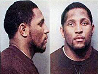 Scary, huh?
(note to Mr. Lewis: if for some crazy reason you ever see this, I'm scared as hell to use your mugshot as a joke. I'm a little pussy schoolteacher in a little hick town in, uh, North Dakota. Yes, that's it. I really mean you no harm, and I think you're a great player. In fact, I tried to get you as my defensive player on my fantasy team, but I ended up wasting my time with Bart Scott. Anyway, it would be really easy for you to beat me up, and you wouldn't feel a sense of accomplishment, so you probably shouldn't.)
(note to Mr. Scott: I don't really think you wasted my time. You had some good games for me. I was just trying to make Mr. Lewis feel better.)
9. San Diego Chargers- The dark blue is cool. The light blue throwbacks are cool. They've got a lightning bolt on their uniform, as if to say, "Don't fuck with us, we've got a lightning bolt on our uniform." TQ of +13.
8. Denver Broncos- So now we're in the top 8, which means these are the best of each division. The late-90's redesign totally helped this team's look. They would probably be higher if not for the Nike connection. Even in the all-whites this team looks good.
 Still better than Oakland's
7. New York Giants- I just like the gray pants/blue tops look, okay! Shut up! I hate you!
Okay, I'm sorry. I was feeling defensive. This looks like an old-school uniform, which of course, is a look I like. I like the lower-case letters on the helmet too. It's just a nice look.
6. Tampa Bay Buccaneers- At least these pirates were finding pewter, which is closer to gold than silver. The dark tops with the dark pants is a menacing look, kind of like seeing a pirate ship emerge from the fog with it's cannons pointed at your simple, unarmed, immigrant-carrying ship. This uniform might do the most for any team as far as making players look scary (+23 TQ).
5. New York Jets- Like the Giants, the Jets went for the extra-mile seeking traditional look. And I like it. The green-heavy jersey with black shoes makes this team look like they should be playing on old, scratchy film.
4. Cleveland Browns- They're really hanging in there with the brown. I think it looks awesome. Well, with the brown tops that is. The white looks like shit.
3. Chicago Bears- You've probably noticed I'm a fan of tradition. Some uniforms need little upgrades (see Green Bay and Philadelphia). The Bears look pretty much the same as they did 50 years ago, and they're awesome. This is probably the jersey second most responsible for improving a player's studliness with a TQ of +22.
2. San Francisco 49ers- "By the seventh day God had finished the work he had been doing; so on the seventh day he rested from all his work, but not before creating the 49ers uniform. And God blessed the seventh day and made it holy, because on it he rested and watched the 49ers play in the beauty he had made (Gen 2:2-3. NIV)"
It's biblical, folks. My hands are tied.
 Amen.
Amen.1. Indianapolis Colts- The most classy, clean, smart look in the NFL. Pretty anti-climactic, huh?


8 comments:
Dude, you're soooo gay! I stopped reading at Green Bay Packers. That means you have an assortmen of Jacksonvill, Tennesee, Houston and many others ahead of them??? You're fucking stupid or color blind. Does the word "classic" mean anything to you? Apparently not. You need a lemon-lime douche.
I think "I was bored this morning" was a vast understatement. Geez!
Dude, harsh comments. I mean, it's not like you discussed Michael Richards using the 'n' word or anything.
I like the Toughness Quotient. However, I would place the Raiders higher if you were to compose a Dirty Play Quotient and how the uniforms relate to that.
Harsh indeed.
It's too bad that you didn't read the rest of the post. I put a lot of time into it. If I were going to really tear into what somebody had written, I would at least have the respect for others and honor for myself to read the whole thing.
If you had made it through the rest of the post, you would have noticed that tradition plays a large role in the rankings, hence the Colts being #1, the Browns being #4 and so on. If you were to talk to Sondog, you would hear that I am probably more tradition concious than most people. For example, I know that the Packers' original colors were gold and blue, in honor of Notre Dame, the school attended by Curly Lambeau. The team's colors were changed in 1959 by Vince Lombardi. The Pack was founded in 1919, and the colors were changed in 1959 in a direct knock to the tradition instilled by the team's founder. Let's not pretend that their green and gold scheme is mythological or anything, especially when it is barely older than the Niners' scarlet and gold, which itself has undergone minor changes to make it look better.
As for the idea that I'm "fucking stupid or colorblind," I don't really know how to address that, aside from telling you that I mention color throughout my post, meaning I at least have some ability to perceive differences between some or all colors. My grandpa is colorblind, but I don't think it was passed down. As for the fucking stupid part, well. I can't really disprove that. I know college accomplishment is a rough indication, but I graduated Magna Cum Laude. I'm pretty proud of that.
Whitney- I don't know you. I know DMo. When he writes that I'm fucking stupid or colorblind, it doesn't bother me because I know DMo and I will be fishing drunk in a few days. I don't think when you write "I agree with DMO," you mean you think I'm fucking stupid or colorblind," but I don't know. I would encourage you to come at me with a little more to support your argument next time.
Sorry I got the name wrong dude. I guess I thought I read it that way one time, and I just kept reading it like that for some reason. It happens when I read books too. Sorry about that.
I wouldn't rip you a new one about your list. You obviously put some though into it. I really appreciate that you put it together, and that you read our stuff in general. It's nice to have some seemingly loyal readers. I feel free to express the discomfort I feel when I get sand in my vagina anytime though.
Oh yeah, and to address the main concern, I just think the Pack's uni in overwhelmingly ugly. Tradition be damned.
I like the idea of ranking unis-
I hate to say it but I agree- my Titans' uniforms are gay. Vince Young is starting to make it look good, though.
Couple of teams I would rank higher- Bengals, Falcons, Raiders (although good point about pirates being after silver, I guess...)and the Steelers. I guess I like the black ones.
Ones I would rank lower-
Colts (nothing scary about looking at that uni, or Peyton Manning either) Lions, Dallas
I love NFL and MLB uniforms. I respect everybodies opinion of what they like. I think all uniforms should be ranked in looks, tradition and marketability. So after thinking it over, I give you my list.
32. Bengals, For such a cool name which would seems easy enough to come up with a good uniform and logo, They fail with pure ugliness. Even a helmet with there logo tiger would start to fix this ugly uniform.
31. Bills, horrible, horrible, horrible. lines don't match up, ugly stitching on the jersey. Looks to me like there trying to make a outfit not a uniform that strikes fear in there opponents.
30. Ravens, Ravens are black, Purple is ugly. If purple has to be the second color, Make sure it stays the second color. No purple jerseys. In fact this uniform is so ugly it needs a redo, Cool helmet just get the purple out.
29. Seahawks, Oh so close. Love the helmet and the colors. Needs minor adjustments and could be one of the best. I hate jerseys that have a different color material over the shoulder pads, like the Bills, Bengals, Seahawks, Titans. Those blue helmets and blue pants with a all white jersey, all dark blue jersey would look good.
28. Vikings, Purple does not look tough anyway shape or form. Cool name and helmet but totally wrong colors. Every Vikings helmet I have seen is silver or gold. I love horns on a helmet , it just looks right. Imagine this helmet in silver. Are you starting to see my vision?
27. Panthers, just ugly, cool colors. do you want to be black or silver or Carolina blue? One quick fix is to have silver pants, But really need a complete overhaul.
26. Jags, I actually like this uniform if they stick to there original plan. when they start with the black pants with no stripes, all black socks and black jersey, as much as I like black, this just looks hideous. Stick to the Teal jersey, White pants.
25. Browns, What is a Brown? I believe it is a dog. Can't you put a bulldog on your helmet or maybe a number. Other then that, team colors are just ugly.
24. Lions, Last overhaul when they included black as a team color or highlight ruined a otherwise nice uniform.
23. Chiefs, Just not a tough looking uniform. Maybe darker red, grey pants (like NYG) Minor overhaul needed.
22. Dolphins, ruined there uniform when they tried to add dark blue to the mix. Minor tweak and they could go way up in they rating.
21. Titans, Actually like this uniform, Just get rid of the jerseys with the different color material over the shoulder pads. Love the colors.
20. Cards, New look just needs some minor adjustments. Please any NFL teams reading this, No more piping on NFL uniforms. If I owned the Cards I would have my uniforms look similar to the Broncos, In red and white obviously. I would put the cardinal on the sleve.
19. Falcons, Almost right, Alittle busy. Get rid of the piping.
18. Eagles, Not bad, Just think if they went alittle old school here they would be better off. First get rid of the white. I think a modern throwback in green and silver, like 1980 Super Bowl team. A updated version of a old uniform like NYG and NYJ. Do this and your team will be in the top five.
17. Saints, Just think Raiders uniforms in gold and black, Less stripes on the helmet, Thinner stripe on pants. Just simplify this uniform to two colors black and gold, Get rid of white. Could easily be one of the best.
16. Packers, I think some minor tweaks are do. To honor Curly, Picture this uniform nearly the same as it is except all the yellow is gold and all the green is navy blue. Betcha it would look cool. Then to honor Vince, in big games (against Dallas or Bears) They could change the navy blue jerseys to green. Yes kinda like Notre Dame.
15. Steelers, cool uni, Have no complaints.
14. Broncos, I like these unis, The only thing different I would do is to put a logo on those blank sleves. Such as there old bucking bronco from the 60's or the D with bronco in it from the 70's. Just something on those sleves.
13. Colts, Cool classic uni, Just not tough enough to be rated any higher in imho. I liked the one year in which Harbough almost beat the Steelers in the AFC Tital game, they had the helmet horseshoe on there left shoulder (like the NYJ's uni)
12. New England, Nice Uni, good colors, No complaints.
11. Bears, O.K. nice unis, But chould you imagine a expansion team that just put the letter of the city on there helmet. Come on use alittle imagination. Is a classic though.
10. Dallas, One of my favorite unis, But i have one complaint. Whats up with the silver, bluish, greenish pants. sometimes they look good from a distance, But get up close on a sunny day and they don't match and look hideous. Stop trying to be fancy and just use silver pants.
9. S.F. 49ers, good looking Unis. Classic look to this updated uniform. More classic teams should take heed and learn how to update a classic look that needs a update.
8. Redskins, Classic looks, Great stripes. I like this uni cause my high schools unis look the same. So I'm a sucker for this uni.
7. Raiders, Great colors and uniforms. I see Raiders as dark in nature who will pillage anything and everything. So I don't mind the Black and Silver. I have one complaint about there logo on there helmet. Get rid of the gay dude and replace him with a mean looking skull with a patch and a helmet.
6. Texans, I just love this uni as long as they don't wear blue on blue or red on red or white on white. Wear them as they were designed, Blue jersey and white pants and white jerseys with blue pants. Great colors, Great Unis.
5. Chargers, Love the new unis, would maybe try the numbers on the helmet. Whole color scheme is great.
4. Rams, One of the best helmets of all time. The recent overhaul was great. the only thing I would have done different is to put some sort of stripe on the gold pants. Now stop trying to ruin this great Uni by wearing dark blue pants or white pants. Gold pants only, Just add a stripe.
3. T.B., Just flat out great uniforms. They look mean. They should implement those black alt unis soon, they will also look great. Awesome.
2. NYJ, From worst to first when they changed from those ugly 80's to these updated throwbacks. Great Uniforms.
1. NYG, Simple updated throwbacks. Love the grey pants, The helmets. The one thing I might do different is to put some logos on those blank blue sleves. Maybe a ny on one sleve and 80's font giants on the other. Then again maybe I do nothing.
Post a Comment